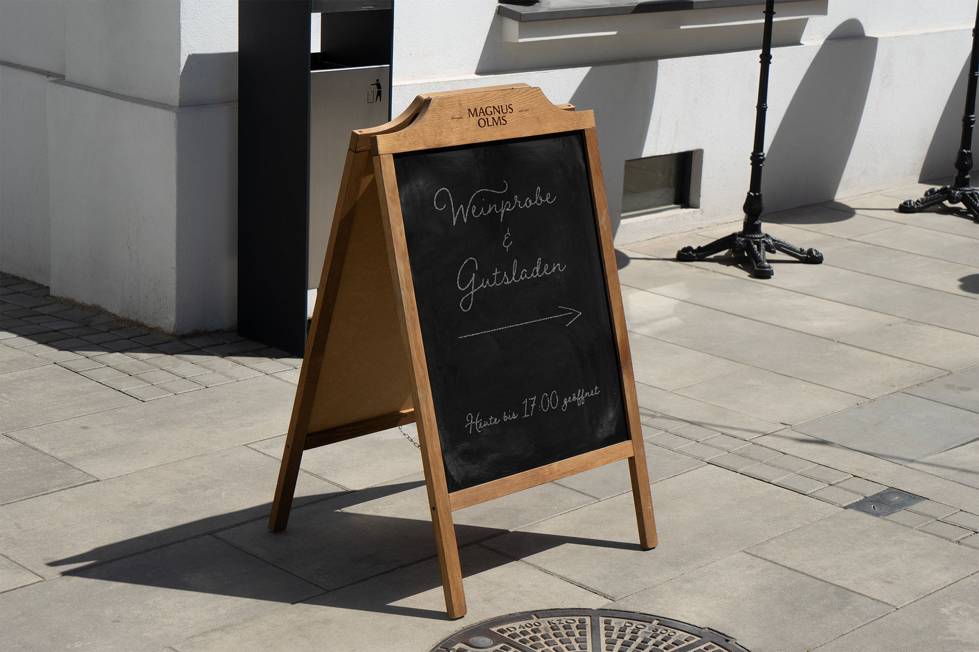
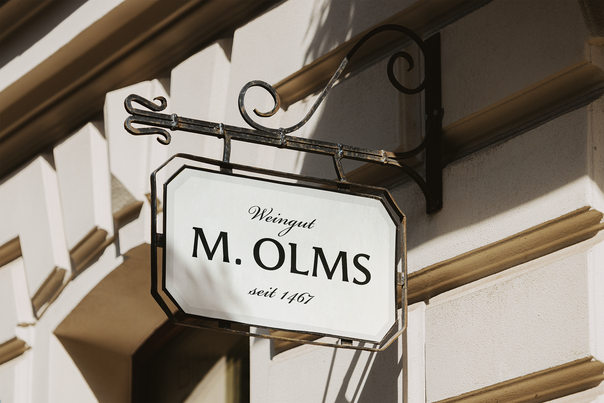
The driving force behind this creative exploration was a branding initiative for the conceptual family winery, Weingut Magnus Olms. Our aim was to create a visual identity that reflected its envisioned quality and legacy, designing a logo, bottle labels, and various brand touchpoints that epitomized the heart of this brand.
Outcome
We crafted a comprehensive brand identity featuring a memorable logo, brand materials including business cards, stationery, a brochure, bottle labels, an intuitive website, and engaging social media content, highlighting its standout presence in the industry.
Services
Brand Strategy
Positioning
Logo & Brand Identity Design
Collateral Design
Website Design
Social Media Strategy
Brand Style Guides
Process Notes
Weingut Magnus Olms is proud of its heritage, blending the traditional art of winemaking with today’s appeal. Their goal is clear: achieve global recognition for their exceptional Rieslings, emphasizing craftsmanship, reliability, and elegance. Catering to wine enthusiasts around the age of 35, these connoisseurs value expert recommendations and seek wines that offer rich narratives and heritage.
In a market with standout names like Carl Loewen, Jj Prum, and Van Volxem, Weingut Magnus olms differentiates itself by showcasing its legacy in a fresh and relatable manner. Every touchpoint, from labels to online interactions, exudes a harmony of past and present.
Logo Design & Development
Creating the Weingut Magnus Olms logo was inspired by the brand’s pillars: heritage, craftsmanship, and elegance. We encapsulated the rich history with a nod to contemporary aesthetics. An emblematic key symbol, echoing the cherished key to the family’s wine cellar, was incorporated, representing both the brand’s commitment to tradition and assurance of quality.
Color
Inspired by the picturesque Mosel river surroundings, the color palette married muted vineyard greens with tranquil blues of the river and sky. These choices reflect the winery’s locale and values: earthy tones underscore the traditional wine-making process, while the blue symbolizes reliability.
Brand Collateral Design
Our approach to brand collateral was grounded in both elegance and clarity. With an emphasis on simplicity, the logo naturally stands out, ensuring the wine remained the star of the show. For business cards, letterheads, and envelopes, we went for a clean design with plenty of white space, creating a polished yet unpretentious feel. The off-white paper choice offers a quiet tribute to the winery’s storied past.
The wine labels, thoughtfully crafted to support rather than overshadow, embraced this design ethos with a prominent blue logo seal at the bottle’s neck. This tactile seal gave the brand a unique shelf presence.
Online Brand Presence
The website for Weingut Magnus Olms bridged the brand’s storied history with modern online features. Through premium photography, we vividly showcased the winery’s legacy, and intuitive site navigation enriched the user experience. The emphasis was on sharing the brand’s journey within a modern e-commerce setting.
Our photography strategy centered around the brand’s refined nature. Instead of overt advertising, we featured genuine moments from the vineyard, spotlighting the dedicated individuals behind each bottle. Social media templates married this imagery with a handwritten typeface, communicating authenticity and warmth.


The Outcome
We developed a brand identity that harmoniously balanced history with contemporary design elements. The emblematic key logo-mark, paired with the nature-inspired color palette, set the brand apart. brand collaterals exuded understated elegance, the website offered a blend of history and online shopping ease, and social media assets grant an authentic glimpse into the heart of the winery’s operations. In the esteemed Mosel wine region, known for its established vineyards, our strategic direction ensures Weingut Magnus Olms stands out with distinction.


